How to improve DORA metrics: experiments that move the numbers
You already know your cycle time is 4 days and your change failure rate is 12%. What nobody tells you is how to change those numbers. This page has twelve example experiments, free to copy, three per metric. It ends with how Aurora Coach turns a stuck number into a change the team commits to, shown on a worked example.
You know the number. It isn't moving.
You probably already own a dashboard: Swarmia, LinearB, Jellyfish, or a DIY board over your Git data. It computes the four DORA metrics nightly and the definitions are settled, so nobody argues about the numbers.
Then the subscription renews and the numbers are where they were. That is not a flaw in the tool. Measuring and changing are separate jobs, and engineering intelligence tools do the first one well, which is why they pair with Aurora Coach rather than compete with it.
A DORA metric is the output of team practices. It moves when a practice changes and the change holds.
How do you improve DORA metrics?
Pick one metric, diagnose the dominant constraint with the team rather than from the dashboard alone, run one time-boxed practice experiment against that constraint, re-measure, and keep or revert. The number follows the practice: it moves when the practice changes and the change holds, and it drifts back when the practice reverts.
Which DORA metric should we improve first?
Usually cycle time or lead time, because its constraint is easiest for the team to name (most often review wait), and shrinking batch size tends to help the other metrics too. The exception is a high change failure rate: fix that first, because making a pipeline faster while it ships failures just ships failures faster.
Do DORA dashboards improve performance by themselves?
No. A dashboard is a speedometer: necessary for knowing where you are, incapable of pressing the pedals. The DORA research itself ties performance to capabilities and practices (trunk-based development, small batches, continuous delivery), not to owning a measurement tool. Teams that buy a dashboard and change no practice renew the dashboard a year later with the same numbers.
How long until a metric moves?
Cycle time responds fastest, for a structural reason: batch-size and review-wait experiments act directly on waiting, which is usually its largest component. Watch your own median rather than trusting anyone’s typical timeline. Deployment frequency moves once deploy is decoupled from release. Change failure rate and time to restore move slowest, because failures are sparse events: expect a quarter of data before trusting the trend. Time-box each experiment anyway; the decision point is what keeps the loop honest.
What is a good lead time for changes?
DORA’s published performance clusters have placed elite performers at under a day from commit to production and high performers within a week, with exact cutoffs shifting between annual reports. The more useful benchmark is your own trend: a team whose median lead time falls sprint over sprint is improving regardless of which cluster it sits in, and the experiments above are how that trend starts.
Are there four or five DORA metrics?
The four classic software delivery metrics are lead time for changes, deployment frequency, change failure rate, and time to restore service. More recent DORA research adds rework rate, the share of deployments that were unplanned fixes, as a fifth delivery metric. Whichever count you use, the improvement approach does not change.
From a monthly release train to changes: a worked example
Simulated team · Real product output Harborline Systems, a fictional B2B infrastructure company: a six-person platform team, managed hosting on 24/7 uptime SLAs, one release a month in a batch of fifty-odd changes. We scripted the inputs and ran them through Aurora Coach in production. Everything below is the product's real output.
1Sense and analyze
Team members answer structured questions in their own words, and can take any thread further with the coach in a check-in. Nothing here comes from a delivery dashboard: the input is the team's own account of the work.
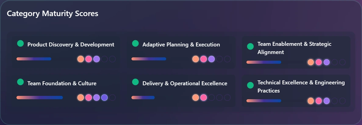
The practice area behind the numbers
The sessions roll up into a score per practice area, five dots each. Count the filled ones: Delivery & Operational Excellence sits at two, alone at the bottom, while the other five land at three or four. This is the team's own read of how it builds and ships, not a delivery metric.
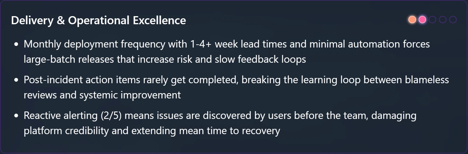
Why it scored two
The product's own reasoning, first line, verbatim: “Monthly deployment frequency with 1-4+ week lead times and minimal automation forces large-batch releases that increase risk and slow feedback loops.” Batch size named as the mechanism, not the symptom.
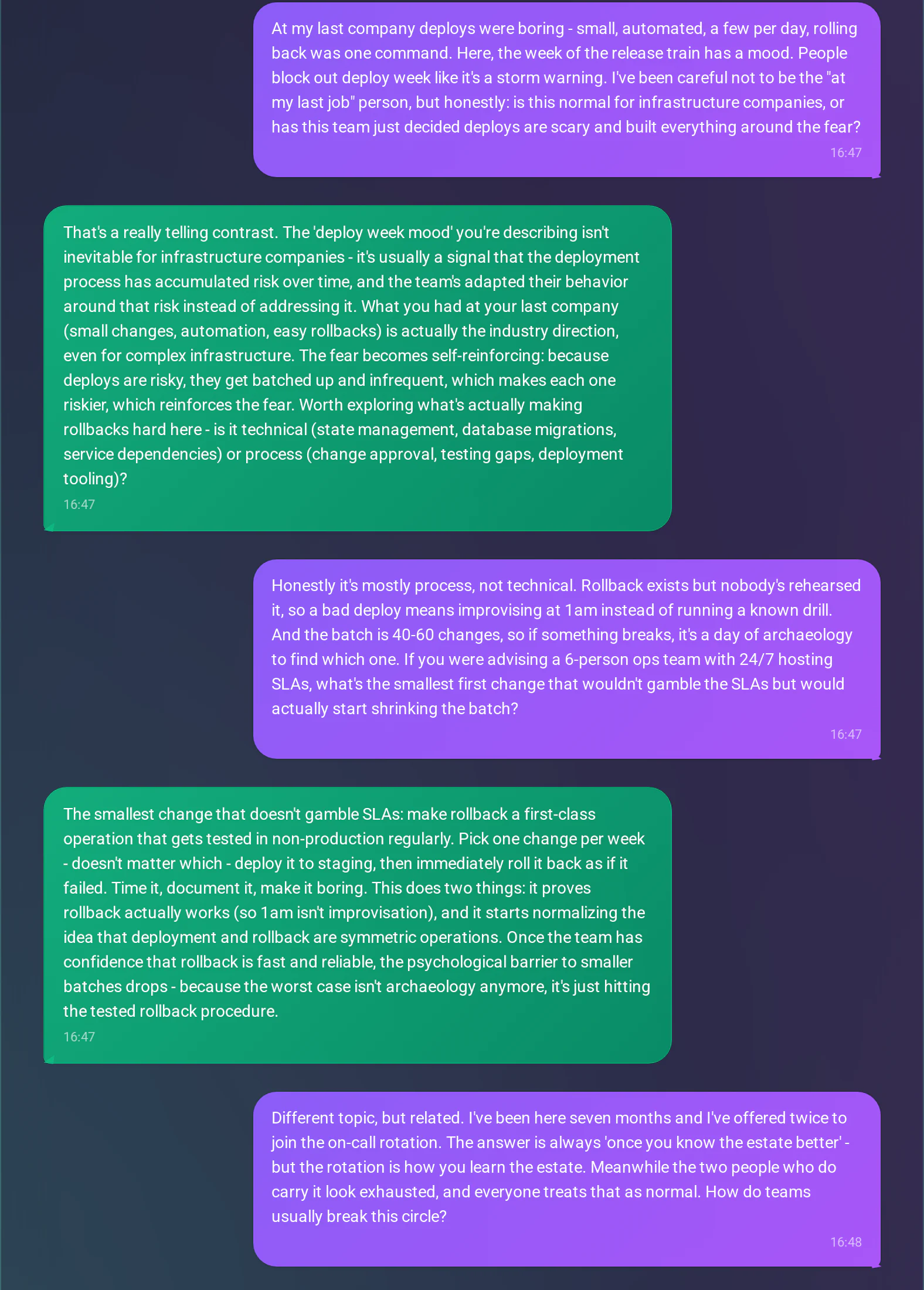
The loop, named in a check-in
The team's newest engineer asks whether deploy fear is normal for infrastructure companies. The coach, verbatim: “because deploys are risky, they get batched up and infrequent, which makes each one riskier, which reinforces the fear.” Pushed for the smallest first cut that would not gamble the SLAs, it puts rollback before batch size: one throwaway change a week, deployed to staging and rolled straight back, timed and documented. Make it boring.
2Recommend, refine, commit
The analysis comes with recommendations, and the recommendations become concrete suggestions the team votes on and commits to. The AI informs the decision, it does not make it.
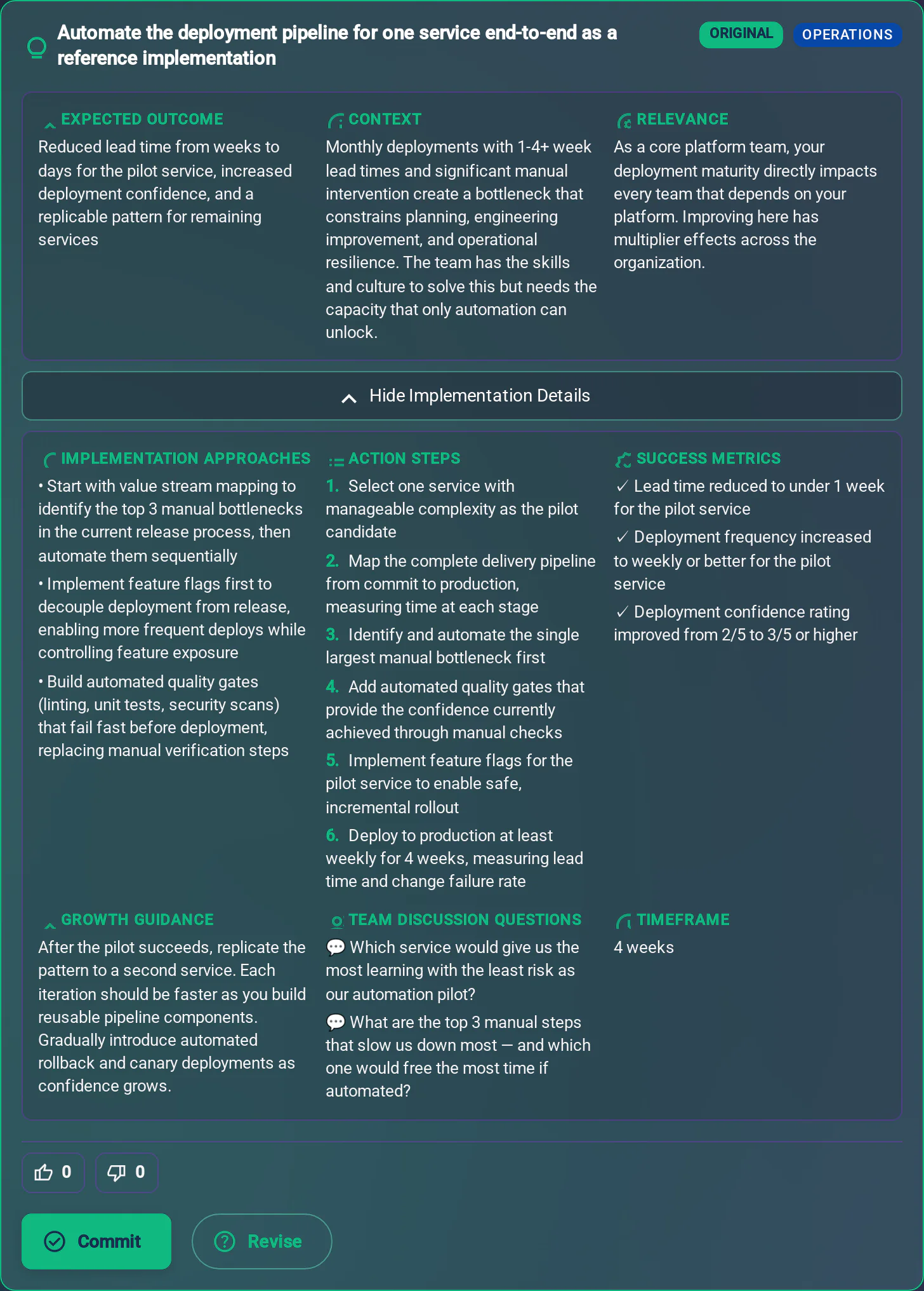
One experiment, with a success metric
The first of the twelve suggestions this team got: automate one service's pipeline end to end, as a reference implementation the other services copy. Six action steps, four weeks, and success metrics in the dashboard's own terms, lead time under a week for the pilot service and deployment frequency weekly or better. Read the Context and Relevance fields. They argue from this team's own situation, a platform team every other team depends on, not from a template. That is what the product adds over this page: the menu above is general knowledge, and this is what it becomes for one specific team.
3Execute and re-evaluate
The team does the work in its own context. The next analysis shows whether the score behind the number moved. Harborline has run one period. The trend view starts when the second one lands.
This is one use case. How the full product works is on the product overview.
Not ready to change anything today? You already have the 12 experiments above, copy buttons and all. If you want one improvement loop like these in your inbox each month, leave your email.
What this page cannot tell you is which of it applies to your team, this quarter. Aurora Coach works that out from your team's own words, recommends next steps with the reasoning, and the next period shows whether it held.
Both are free. The ROI mapper needs no signup and takes about two minutes. What team members write stays private to them: see AI governance.